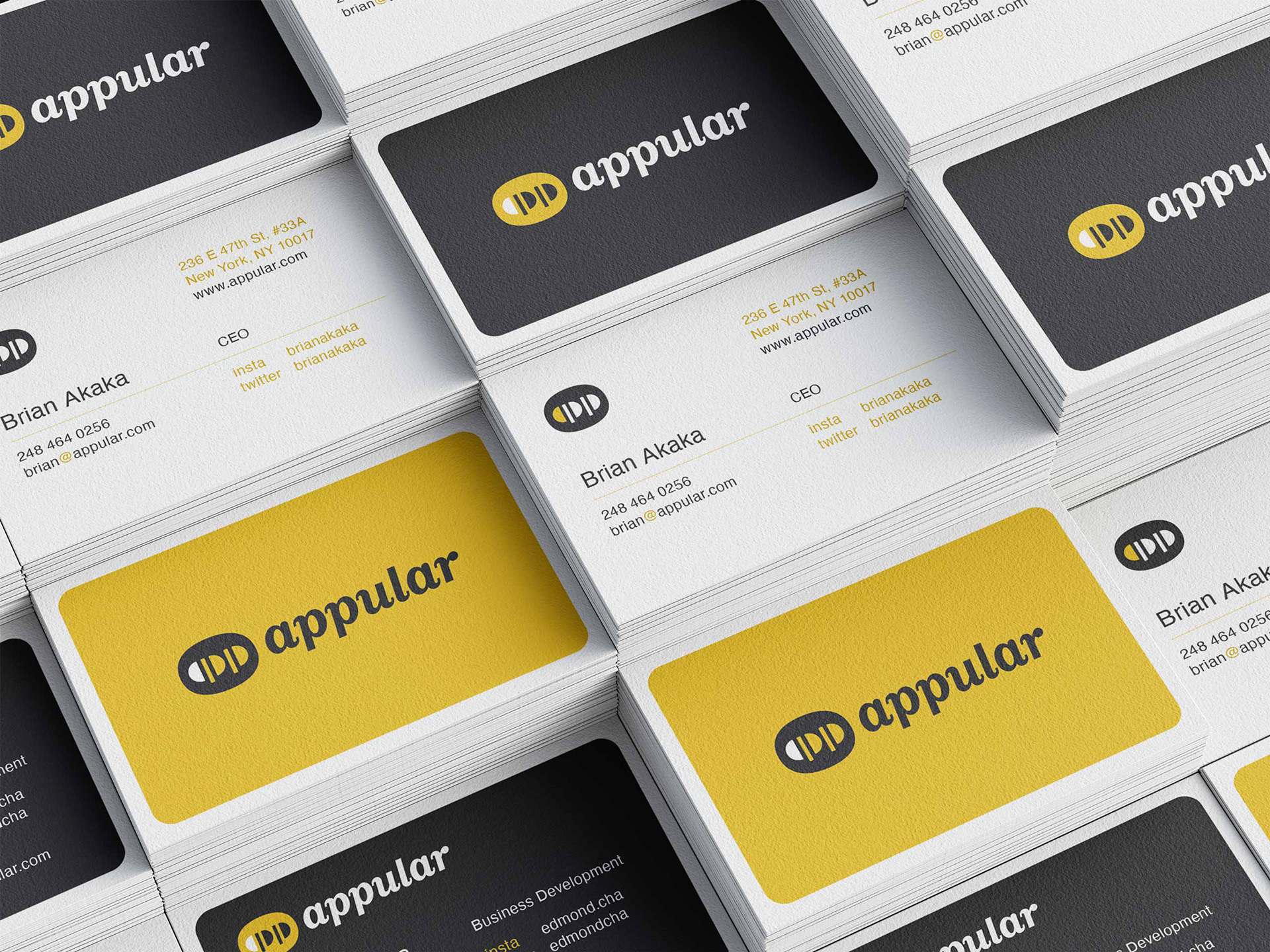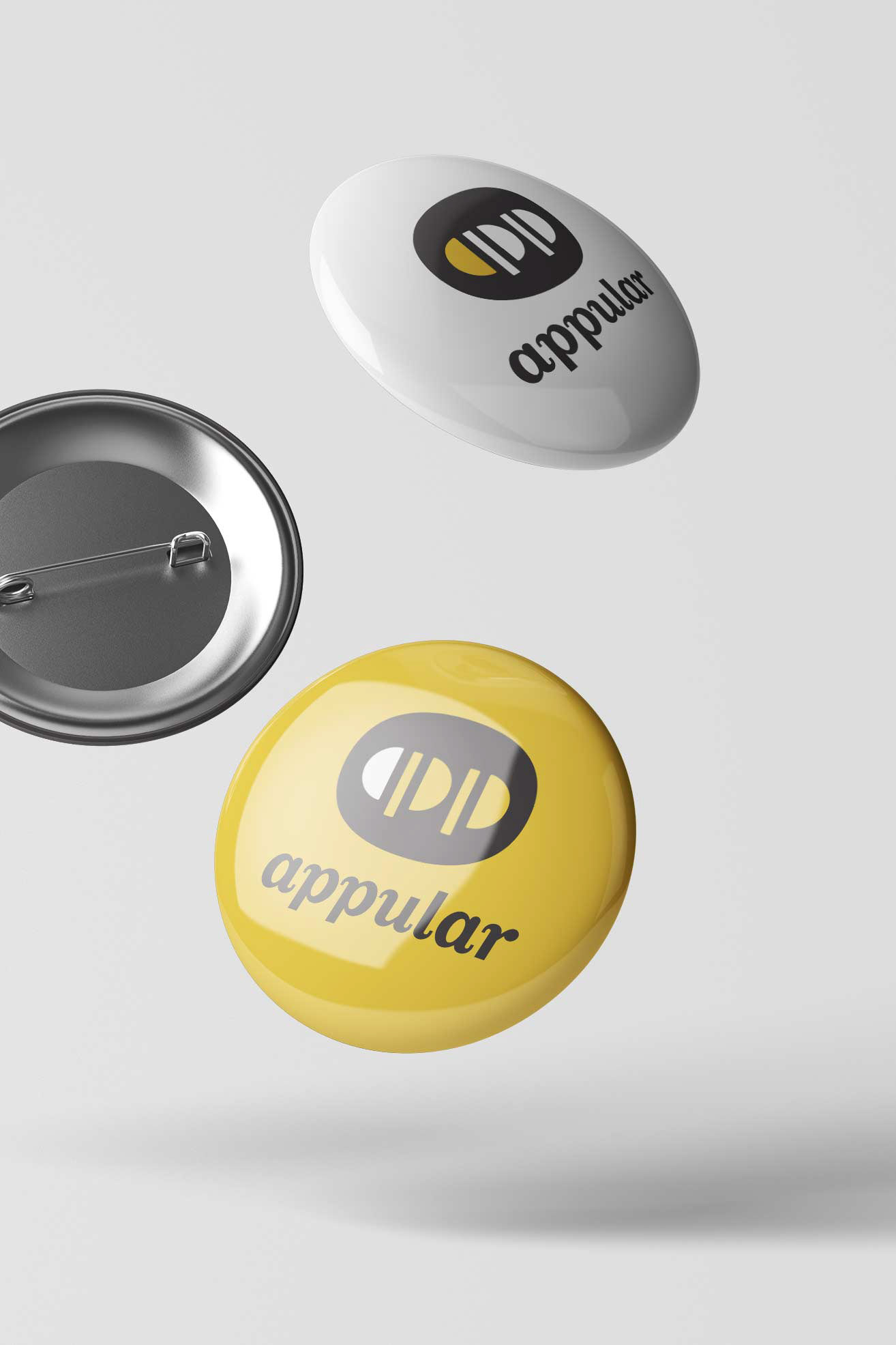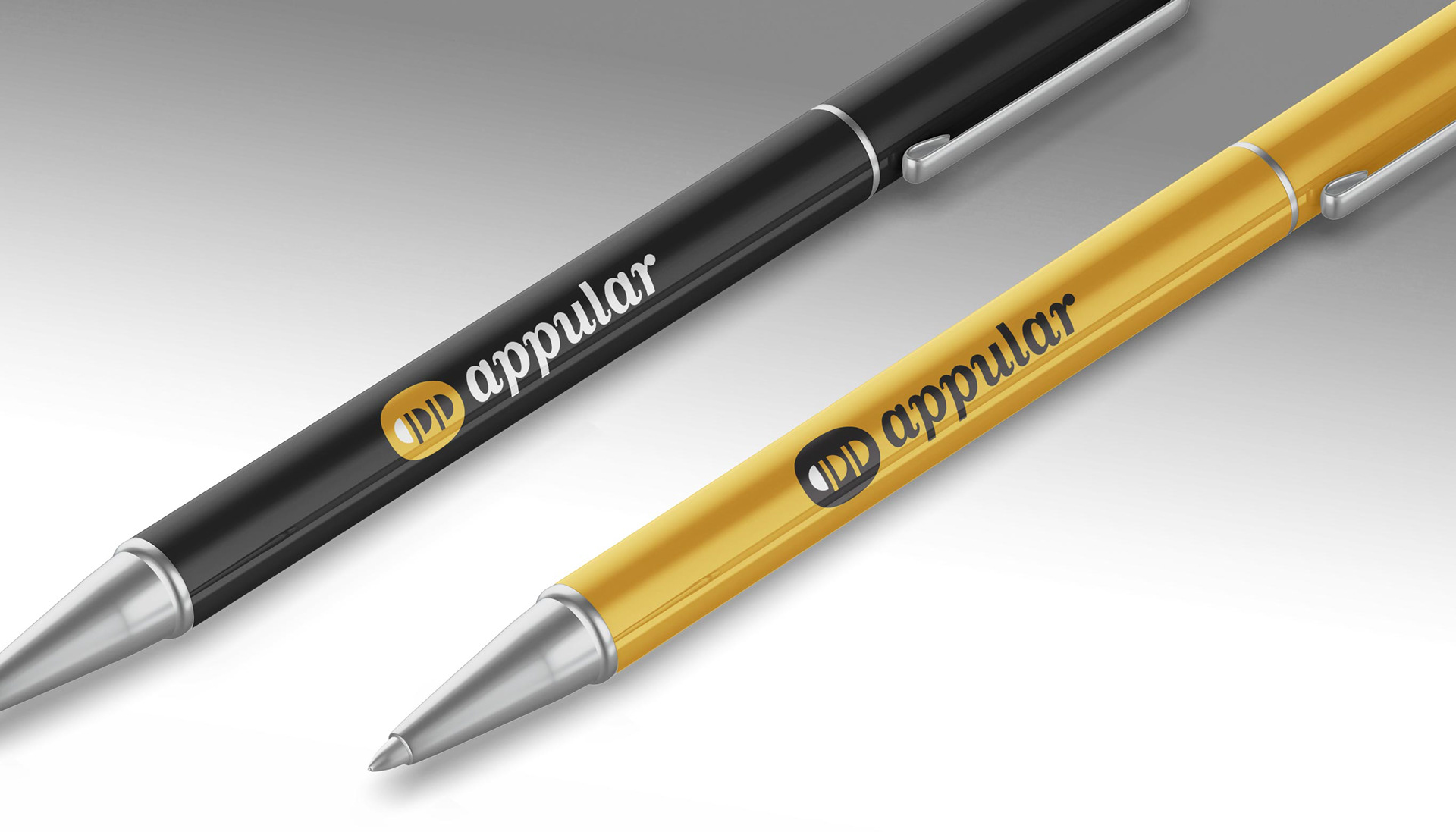
The Appular logo is a combination of the word "app," and two fruit trees, which is a subtle nod to Apple, who had just launched the first mobile App Store at the time. A bold, high contrast yellow and black color palette was chosen to help Appular stand out and differentiate itself in the young digital landscape.
Various versions of the logo were developed to help create a strong and flexible system, which was extended into print, digital marketing and brand collateral.