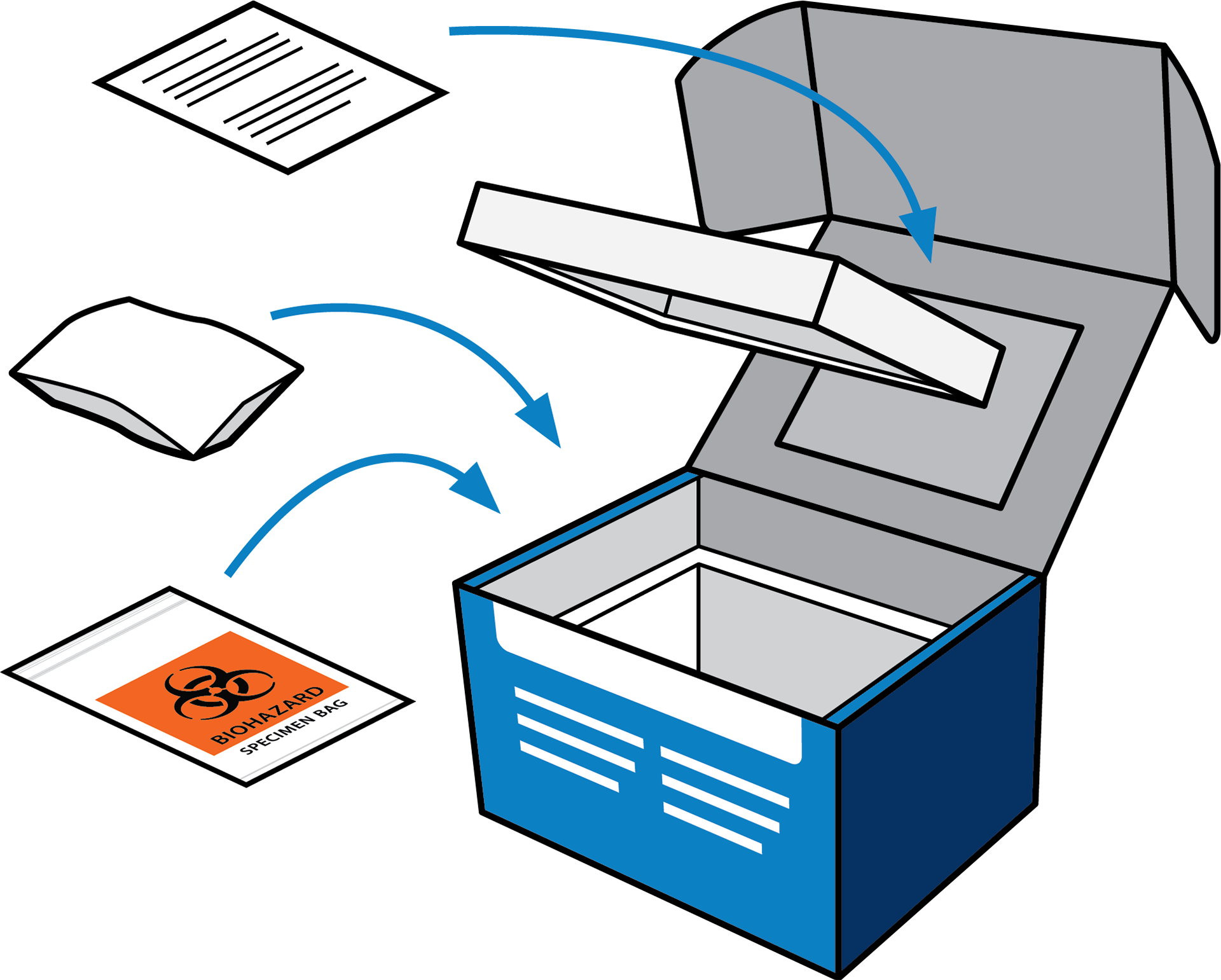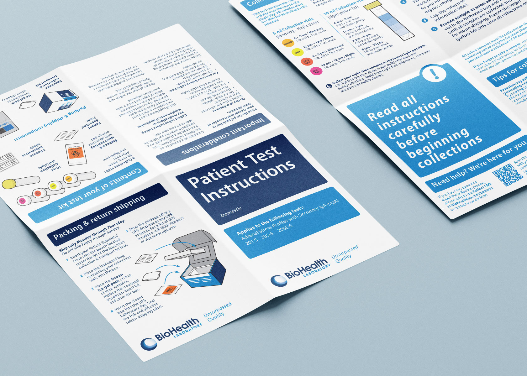
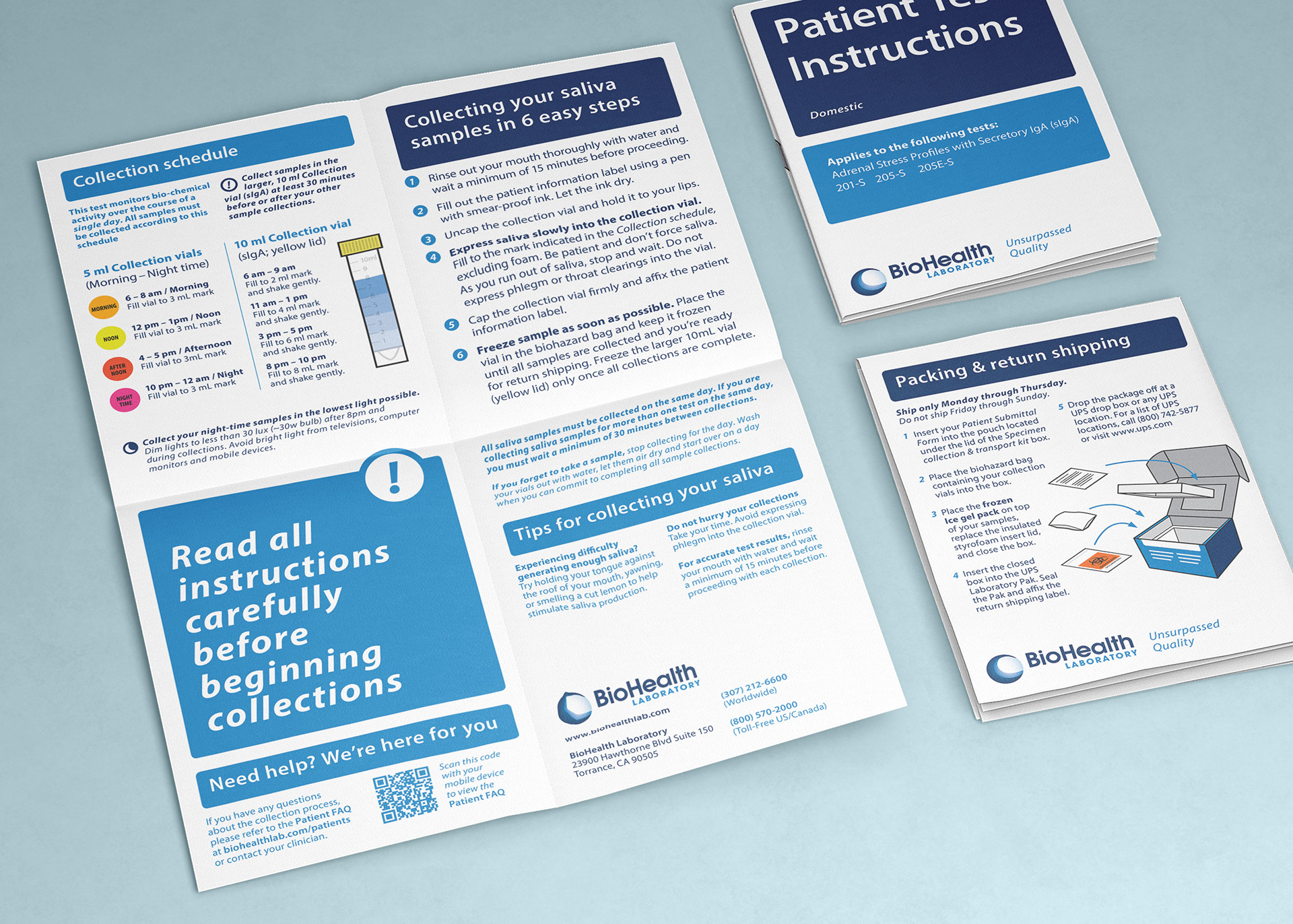
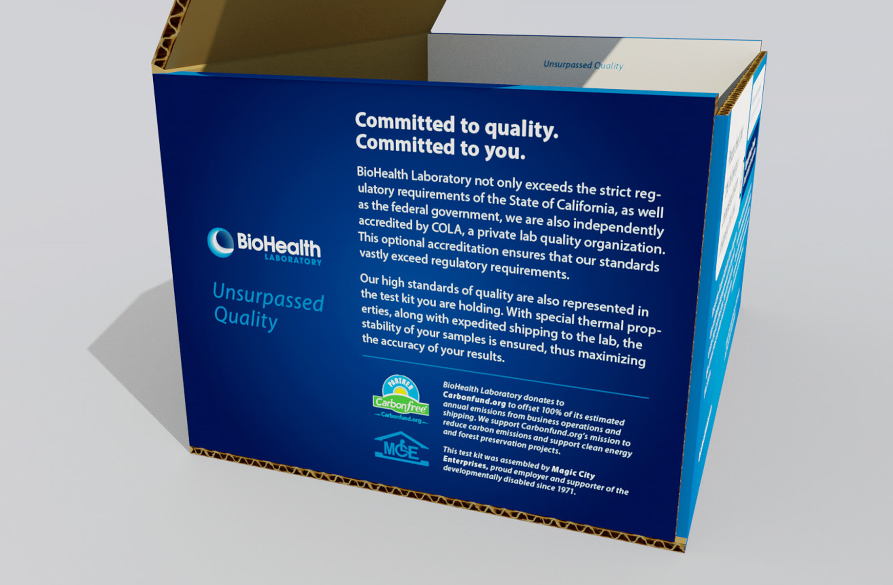
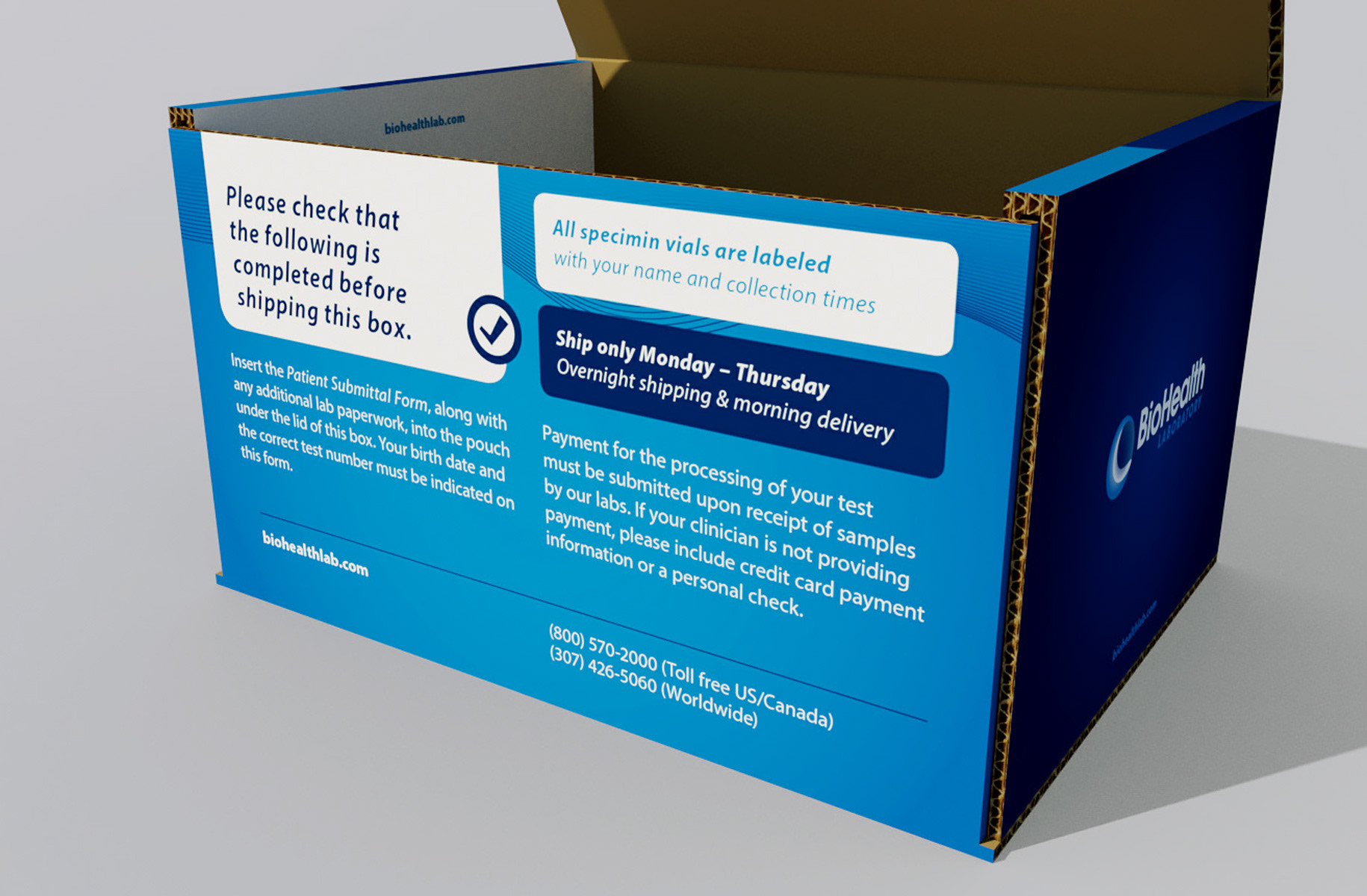
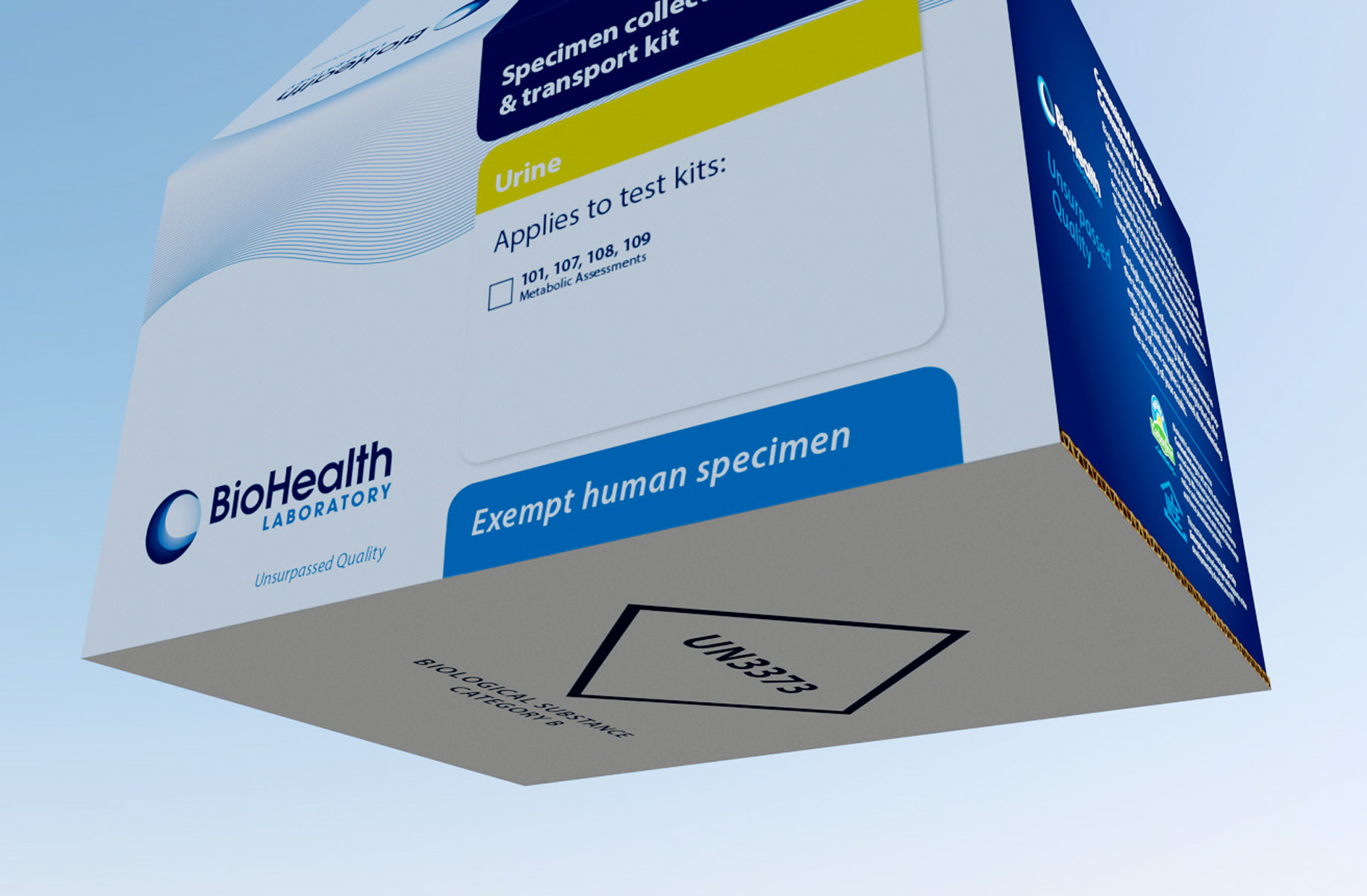
Test kit packaging was completely redesigned, inside and out, with an emphasis on legibility and approachability. These box mailers are the first major brand touchpoint for many customers, and helped differentiate and raise the brand above the competition.
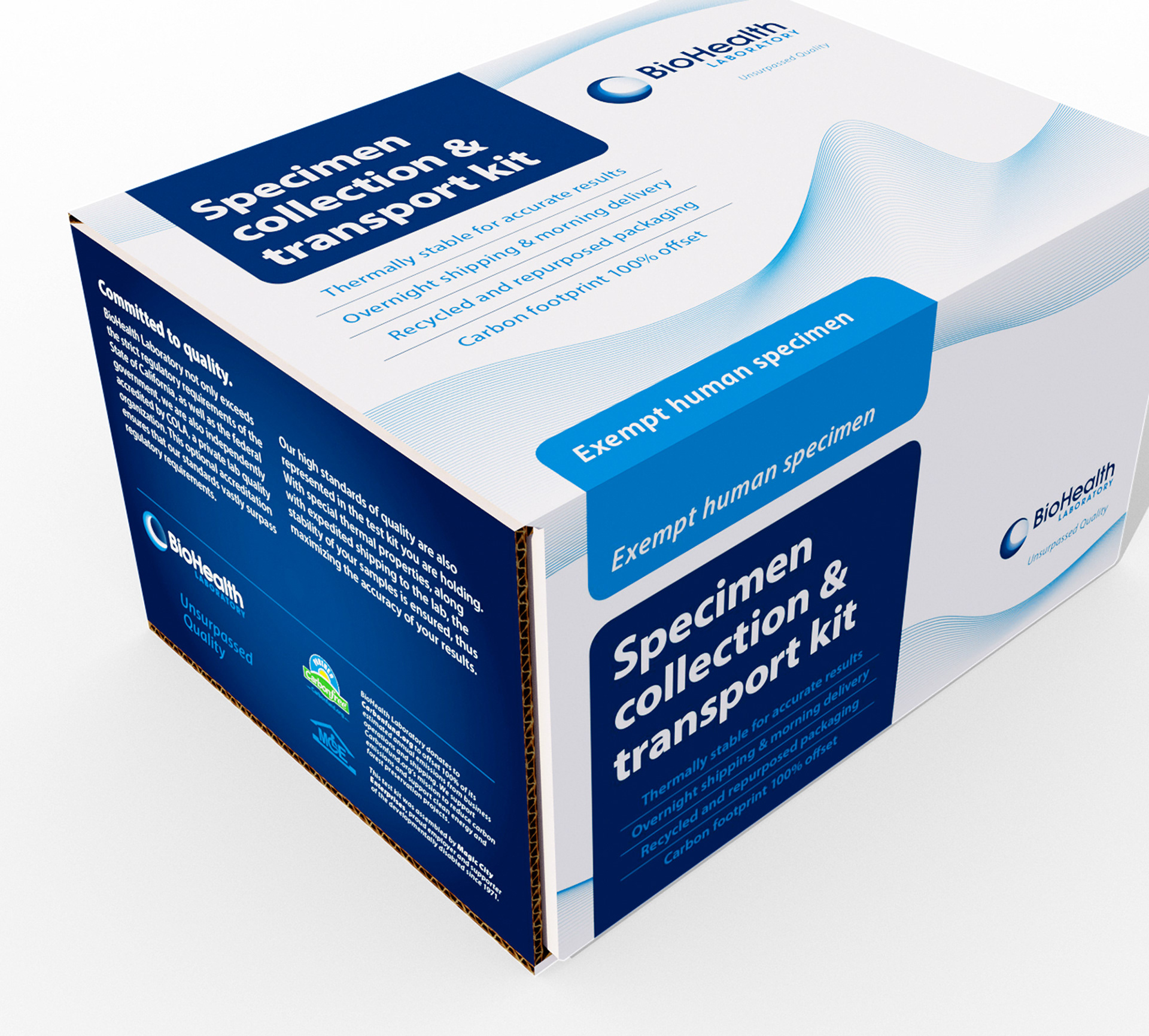
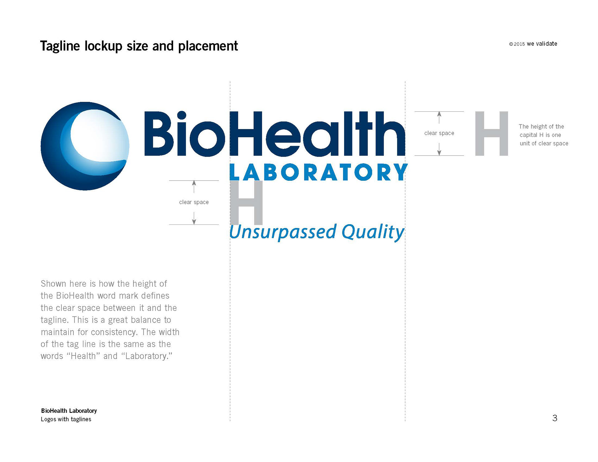
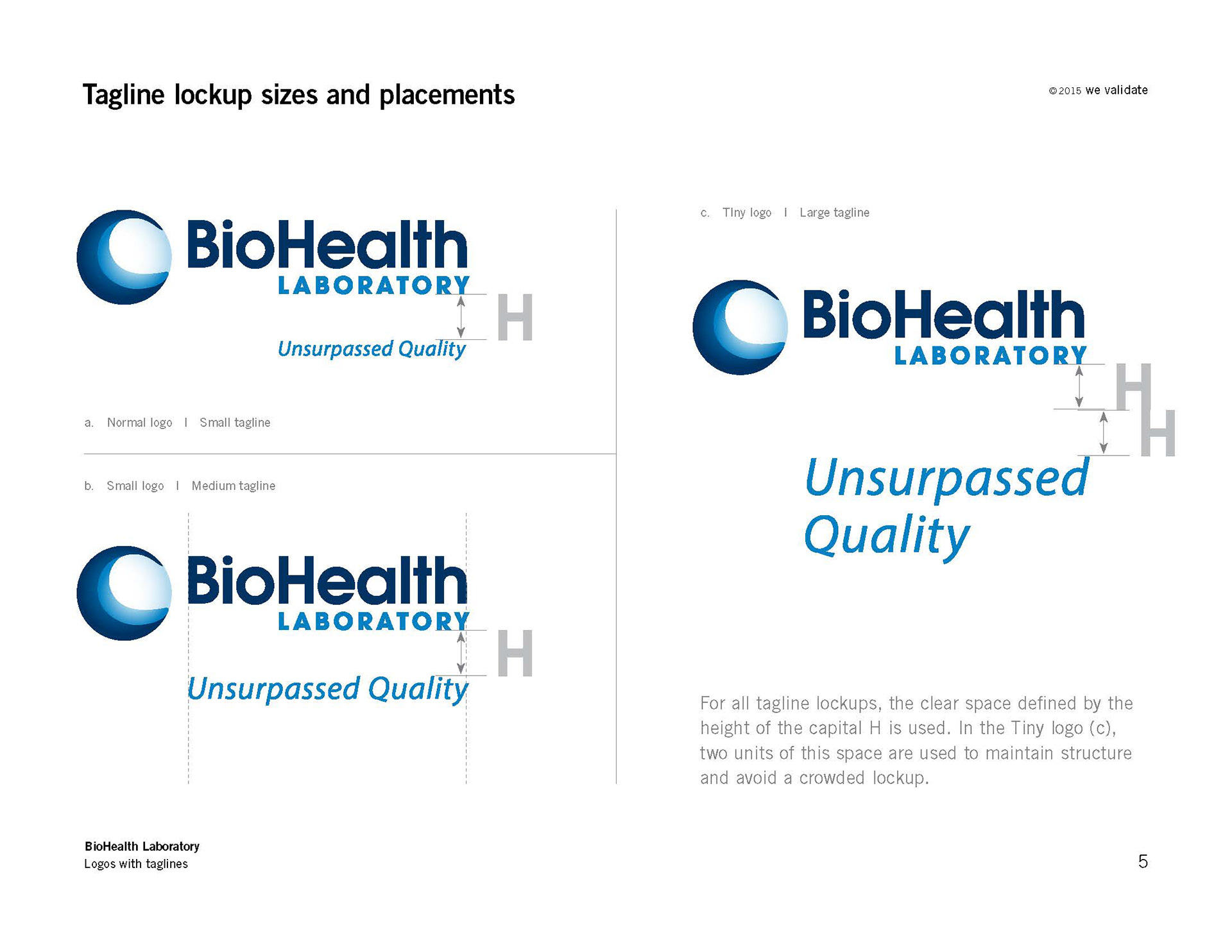
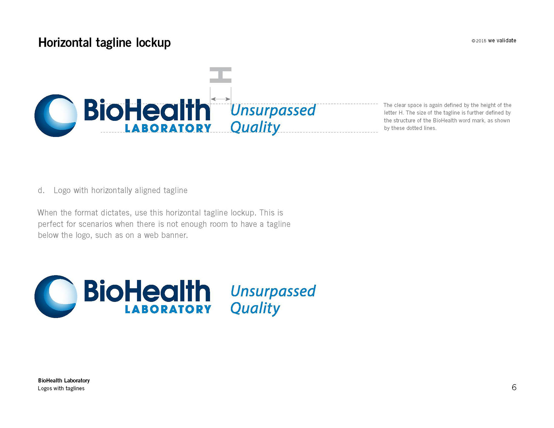
A full brand refresh was conducted, which included a new logo and visual identity which was applied to all print, packaging and digital collateral. The logo refresh included variations with tag lines of several sizes, for consistency and flexibility.


The brand identity refined down to two primary colors and a typeface family with the focus always on customer approachability and legibility. A wave motif was developed to act as a background and tie in with the logo. A system of visual design elements were developed to enhance visual hierarchy and typography across the materials, which helped customers and employees to quickly and easily identify and interact with the myriad of products in the lineup.


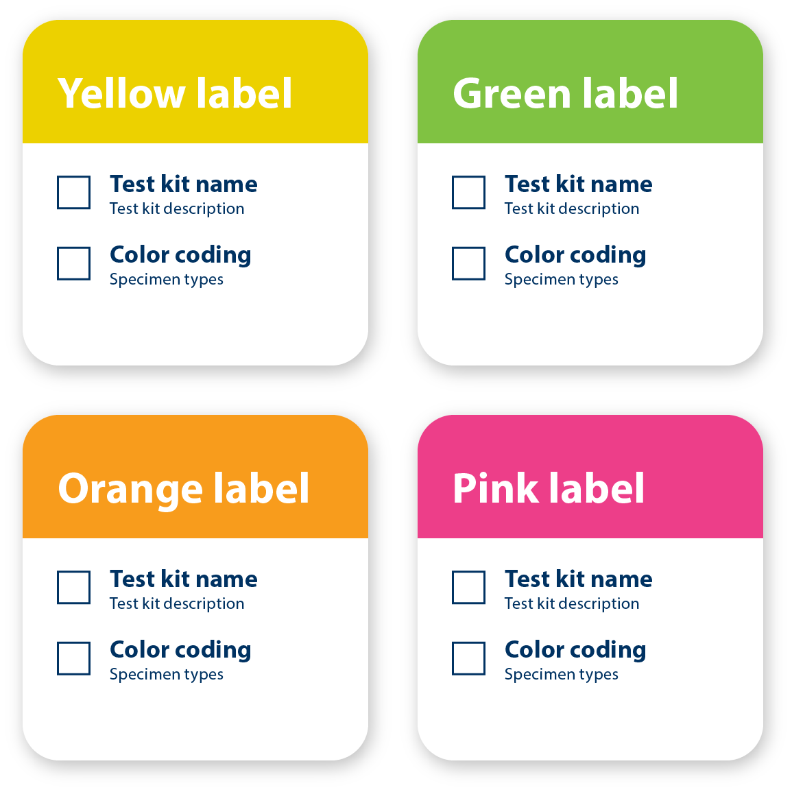
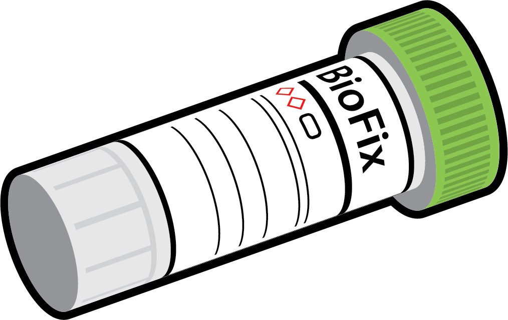
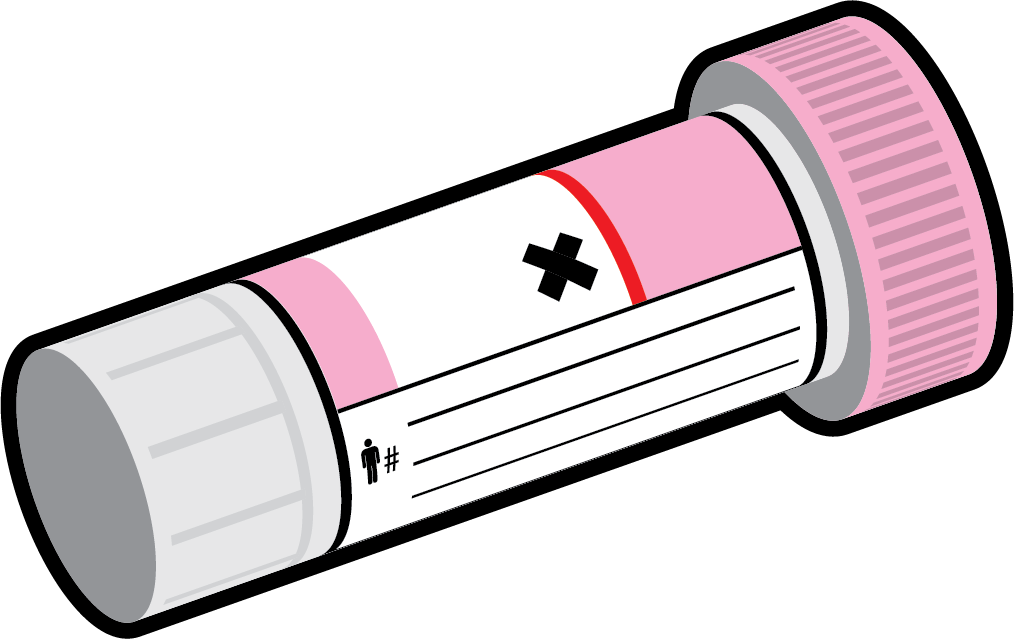
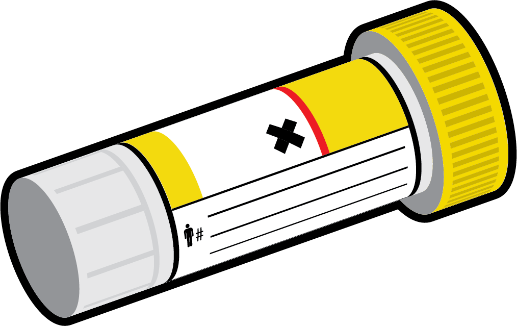
A set of clear and consistent illustrations were developed to use across the entire lineup of test kits. The visual accuracy and clear and consistent color coding helped customers collect samples with fewer errors.